Website Banner Guidelines
If you would like to promote your event, course, activity, etc. on the front page of the web site, please email the PublicityTeam with relevant relevant information that will be required depending on the type (see Promotion Guidelines). The process process is documentated here and the roles and responsibilities are described here.
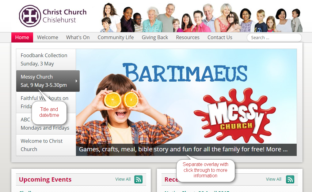
Here is an example banner:
Contents
Banner specification and quality standards
Website Page Banner
- Height: 475 pixels
- Width: 1280 pixels
- Size: 150 kilobytes
- Format: JPEG (if photo heavy) or PNG (if abstract)
Website Page Banner Thumbnail
- Height: 137 pixels
- Width: 369 pixels
- Size: 50 kilobytes
- Format: JPEG (if photo heavy) or PNG (if abstract)
Facebook/Twitter Page Cover
- Height: 632 pixels
- Width: 1702 pixels
- Size: less than 2 MB
- Format: PNG
Content Guidelines
As the banners are so prominent on the front page, every banner should look professional and friendly. Please review the Branding Guidelines if you haven't done so yet.
In addition, it should be easy to read the banner in the time that the banner is shown on the webpage which is only a few seconds. Here are some dos and don'ts:
- Do use a professionally created picture. If you don't have one, consider buying one from a stock sitefor a small fee (typically a few pounds). Click here for list of photo stock accounts.
- Do make sure that the banner picture fills the whole banner space, not only part of it.
- Do include a title in the banner with a large font. Also, if this is an event, please include event details on the banner. Visitors to the website should be able to get all key details from the banner.
- Do consider how the banner will look in the context of the front page.
- Don't use low resolution images that show pixelation or blurriness.
- Don't use low constrast writing which may be difficult to read.
- Don't use stylised clipart.
- Don't add Click here for more information.
- Don't add a lot of text to the banner because it will difficult to read and search engines can't read it.
- Don't reduce the size of the banner so much that compression artefacts are clearly visible in JPEG image files. Please note that PNG image file never show compression artefacts.
Here is an example of a good banner:
Although the following banners have a high quality background, there are a number improvements that could be made:


